- Role
- Product design
- Engagement
- Portal design and delivery
- Focus
- GovTech · HealthTech · Public sector UX · Regulated workflows
01 / Context
The product and its operating environmentA secure property-owner portal giving more than 1,200 Port Hope residents access to property-specific remediation information, documents, updates, and digital actions.
02 / Challenge
The complexity worth solvingPublic health information had to feel understandable, not intimidating.
myPHAI needed to help Port Hope residents monitor radon-related work while operating within strict government and health protocols. The challenge was presenting regulated information clearly enough for everyday users without oversimplifying what mattered.
03 / Product direction
From regulated information to resident clarityUnderstand
I structured the experience around the information residents needed to understand progress, status, and next steps without exposing them to unnecessary operational complexity.
Structure
Information was organized progressively so users could grasp the current state first, then access supporting detail when needed.
Deliver
The resulting experience translated government and health requirements into a clearer digital journey for residents monitoring work related to their properties.
04 / Key decisions
Three moves that shaped the productStatus before detail
Progress and current state were prioritized so residents could understand what was happening without interpreting dense technical information.
Progressive disclosure
Detailed health and project information was revealed when relevant, keeping the experience approachable while preserving necessary context.
Trust through clarity
Language, hierarchy, and system feedback were designed to make a government-related workflow feel transparent and dependable.
05 / System
Consistency for a regulated experienceDesigned to make complex information easier to follow.
Reusable patterns for status, records, information hierarchy, and system feedback helped keep complex public-health information understandable across the product.
06 / Product screens
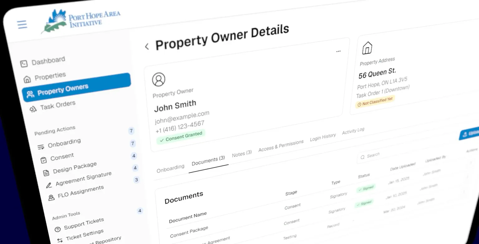
Swipe, drag, or use the arrow controlsProperty owner portal
Responsive desktop and mobile experience


Administration portal
Operational workspace for officers and administrators


07 / Outcome
What changedThe work transformed a regulation-heavy process into a more understandable digital experience, helping residents follow progress and access relevant information with greater clarity.
08 / Reflection
What I carried forward“In public-sector products, clarity is part of trust. Users should understand what is happening without needing to understand the system behind it.”